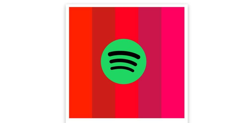
The Spotify Palette is yet another sharing Spotify tool that has been discovered in the wild. This data-driven Spotify offshoot offers a fresh, approachable, creative way to share one’s musical preferences with followers on Facebook and Twitter. The best part is that it can be set up, decoded, and shared in a matter of seconds.
Dozens of bite-sized options for sharing user profile data have been formally offered by Spotify. Its algorithms are designed to produce material depending on user preferences, so turning that functionality into popular social media posts was an obvious choice. The concept immediately took off, and now, years later, Spotify almost owns at least one weekend each year as users post and share their year-end playlists with followers.
More recently, Spotify has allowed third companies to access user data in order to integrate new services. Unofficial features like Spotify Palette, a system that divides a person’s recent listening habits into musical attributes and assigns each trait a colour, are the result of this choice. As the name suggests, those hues are arranged into a palette to produce a distinctive visual representation of one’s listening preferences. Israel Medina, a software developer whose LinkedIn profile is tied to the bottom of Spotify Palette’s home page, created the system.
How to Make and Use Your Spotify Palette
Nearly nothing could be simpler than signing up for the service. Users will see a login button when they arrive at the Spotify Palette website on a mobile or desktop browser. If you are already signed into Spotify on the aforementioned device, you should only need to click one button to log in; otherwise, be prepared with the necessary information. Shortly after logging in, Palette completes the task of creating the… palette… and presents a few extra possibilities.
For a brief explanation of what those colours stand for, scroll down. One may say, for instance, that someone with a playlist primarily made up of upbeat music has a red palette since “Red is the colour of passion or desire and can also be connected with energy.” There will also be a few obscure statistics about the music that was utilised to create the palette below that explanation, such as “Average Valence” or “Average Energy.”
On the screen, a little “hamburger” icon brings up a menu with three choices. One takes the user to a collection of recent tracks that had an impact on the created palette. Of course, each song contains a link to play the track on Spotify and further verify the information. An intriguing creative display is accessible via a second choice. The Google Arts and Culture database will be searched for pictures or works of art that have colour schemes that are similar to the user’s palette. It’s both mysterious and captivating, The final menu option subsequently re-displays the palette. Then, using Spotify Palette, simply take a screenshot of any of those pages and let other people make assumptions about what a green song would sound like.


