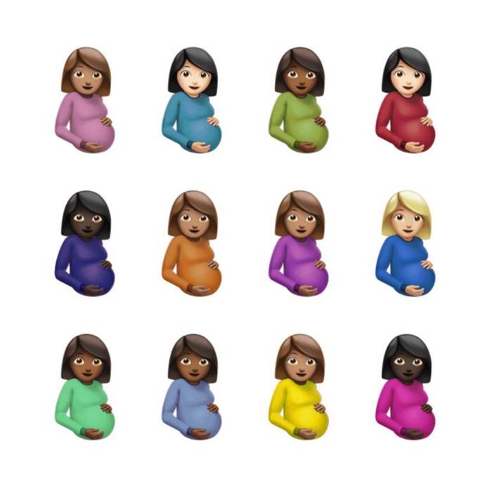
After more than three years of anticipation and months of watching Drake’s sixth studio album be teased through partnerships with companies like Chrome Hearts and Nike, we finally learned that Certified Lover Boy was dropping this week when Drake posted an album cover covered in emojis of expectant mothers. Despite the fact that Drake’s adversary Kanye West chose to just use a black square as the album cover for Donda, Drake’s aesthetic decisions generated a lot of ire and uncertainty.
Yes, Certified Lover Boy’s album cover is probably not going to be listed among the best ones ever created. Drake has nevertheless produced a variety of excellent and terrible album covers over the years. Who can ever forget the legendary graffiti written by Jim Joe on If You’re Reading This It’s Too Late or the painting of baby Drake on Nothing Was The Same? Remember the memes that were created on Twitter after Drake’s album Views was released? That’s how legendary Drake’s album covers are. To honour the release of Certified Lover Boy, we ranked every Drake album cover and mixtape, from So Far Gone to Dark Lane Demo Tapes. See how your fave Drake album covers fare by scrolling down.
Care Package
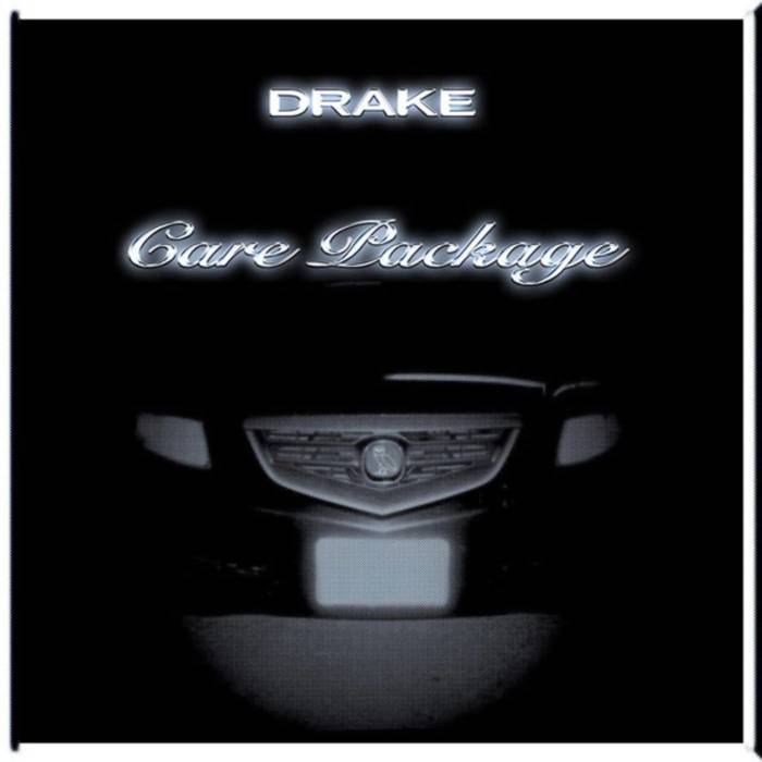
For Drake fans, Care Package was a journey down memory lane. It was his debut compilation album, and it had songs from years 2010 to 2016 that weren’t released until this project was released in 2019 and weren’t streamable or for sale before then. The album cover feels unremarkable, which may have been done on purpose given it depicts Drake before he rose to fame. Some have compared it to Drake’s 2004 Acura TSX, which has an OVO owl emblem on its grill, and it has white text with a glow that appears to be inspired by Pen & Pixel. Does it seem telegraphed? Yes. We understand why it didn’t need to be costly or distinctive in the same manner as Drake’s other album covers since this endeavour wasn’t selling new music per se. Arios Hughes
Certified Lover Boy
The cover for Certified Lover Boy is undoubtedly a discussion starter, if nothing else. Damien Hirst, a renowned modern artist, created the white background on which 12 pregnant women emojis with varying skin tones and sweater colours are placed. His distinctive spot paintings are reminiscent of the colourful knitwear. What does it actually mean, though? Is Drake merely showing off by hiring a well-known artist to create his album cover? Is it a strange way to express the album’s name? I suppose getting 12 ladies pregnant would definitely qualify you as a lover boy. The length of a full-term pregnancy is nine months, which is why some fans on the internet have concocted the hypothesis that because CLB was first announced in January, the emoji was chosen because it had been nine months. Could that be part of his on-going verbal spat with Kanye West? One of Hirst’s artworks was allegedly going to be used by Ye for the Donda cover. We lack the solutions. This is a strange one in either case. The songs on CLB will undoubtedly satisfy. Oh, this cover. We wish he had kept with the ski mask-wearing cupid or the yellow “CLB” writing that had been used to advertise the project for months instead. Michael DeStefano
Dark Lane Demo Tapes
When: 2020
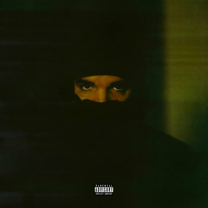
It is stated that Drake’s Dark Lane Demo Tapes is more of a collection of singles than an album. However, it didn’t imply that the presentation was compromised in any way. Drake enlisted Theo Skudra, his go-to videographer, for this release. The ominous photo of Drake wearing a balaclava that appears on the cover was created by the image maker. Drake has frequently been on the covers of his albums. It is, in fact, frequent. The title and mood of some of the project’s best tunes, including “War” and “Demons,” are well matched by this particular design, which makes it appear more deliberate than careless. The original image was captured with a vintage Polaroid large format camera. The cover was really resized from an 8×10 portrait. Skudra discussed his collaborative relationship with the rap icon in an interview with Complex from 2020.
“I actually get that question about what happens next a lot, and that kind of starts to develop this mindset that what I’m doing with Drake is transient, but I don’t really view it that way. To me, working with him is a collaboration that I don’t see needing to end. —MD
If You’re Reading This It’s Too Late.
When: 2015
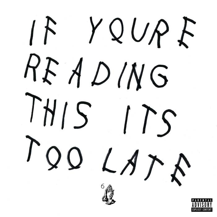
If You’re Reading This It’s Too Late’s album cover, which included chicken scratch lettering, may be one of Drake’s most recognisable artworks. Although it appeared that Drake created the album art by simply writing the title of his album on a piece of paper, it was actually the brainchild of the enigmatic street artist Jim Joe. Jim Joe, a native of Montreal, Canada, became well-known on the city’s streets in the early 2010s by spray painting his Samo-like tag with cryptic messages all over Downtown Manhattan. A young Virgil Abloh ultimately took notice of his art and hired Jim Joe to paint graffiti for the video lookbook launching his first foray into the streetwear industry, Pyrex Vision, in 2013. Soon later, Kanye West asked Jim Joe to create a different Yeezus album cover. Jim Joe worked with Travis Scott and Cactus Plant Flea Market, among others, but his most well-known piece to date is the cover he created for Drake’s acclaimed 2015 mixtape. Nearly five years later, Jim Joe is still one of graffiti’s most mysterious individuals despite working with companies like Louis Vuitton and giving talks at Harvard. If you discover one of Jim Joe’s tags on a piece of abandoned furniture in New York City today, consider yourself lucky if they haven’t already been stolen by would-be street art resellers. This album cover is among Drake’s best and most enduring works of album art because of his partnership with an accomplished street artist. —LT
More Life
When: 2017
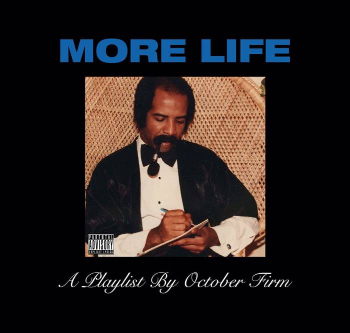
Every time we see one of Drake’s outrageous ensembles, we know that someone had to have given him such a tremendous sense of fashion. Enter the drip god who gave birth to the 6 God, Drake’s father Dennis Graham. Anyone who has seen a picture of Drake’s grandfather knows he always has fits and drives everyone crazy. We can tell that Dennis was a Certified Lover Boy during his golden years since he was frequently spotted sporting a very huge moustache, suits, and fedoras. And when Drake and his father go out together, it’s obvious that the father-son team is compatible since they always manage to wind up wearing similar clothing. So what better way to honour your fashionable grandfather than to feature him prominently on the record cover of your own music? Drake featured a photo of his father from the 1980s front and centre on the cover of More Life, which was first made available as a “playlist.” Dennis provided the background information for the famous photograph during an interview with a British radio station. “I shot this image in 1983 while sitting next to a piano and writing a song. That’s where it originated. Just watch the music videos for “That on That” and “Kinda Crazy” if you ever wanted to know what kind of music Dennis writes. Drake obviously merely emulated his father’s fashion sense. —LT
Nothing Was The Same
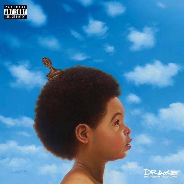
Those who are sceptical of Drake’s legacy frequently mention that he “doesn’t have a classic record.” The argument that Nothing Was the Same from 2013 is his actual classic is frequently refuted (although it’s debatable whether he has any others). The fact that this album also featured his best cover art shouldn’t come as a surprise. One may quickly recognise the picture of baby Drake’s head in the clouds. Another cover for the deluxe edition features an adult Drake in place of the afro-rocking baby, however, let’s be honest, the first cover is superior. Kadir Nelson provided the cover art. The original painting is actually considerably bigger and shows both Drakes staring at each other on the same canvas. The New Jersey-born artist revealed to MTV in 2013 that he first got in touch with Drake when the rapper expressed interest in one of his works on exhibit in a LA studio.
Scorpion
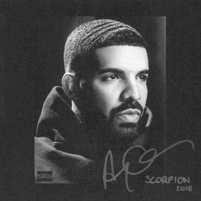
Drake entered Scorpion bloodied and bruised. With his highly publicised match against Pusha T, which ended with a TMZ-like revelation that the rapper had a son, he had just suffered his first actual defeat in a rap feud. His fortress had been breached, his inner sanctum had been looted, and the supposedly unbreakable image he had developed over the previous ten years felt, if only momentarily, compromised. Drake chose a black and white photograph for the cover art for the first time, capturing that exact moment. As confusing as the album is, so is the portrait. It doesn’t portray a single emotion. He doesn’t appear as morose or as determined as he did in Take Care or Nothing Was The Same, respectively.
Drake’s double-sided album comprises some of his most successful tracks, including “God’s Plan” and “Nice for What,” but it also includes a second act, which he refers to as “tragic” on “Sandra’s Rose,” and that duality is mirrored in the album’s cover image. Despite Scorpion’s ambiguity, Drake’s verse “My Mt. Rushmore is me with four different expressions” on the album’s opening track crystallises the meaning of the cover art. Ryan Rose
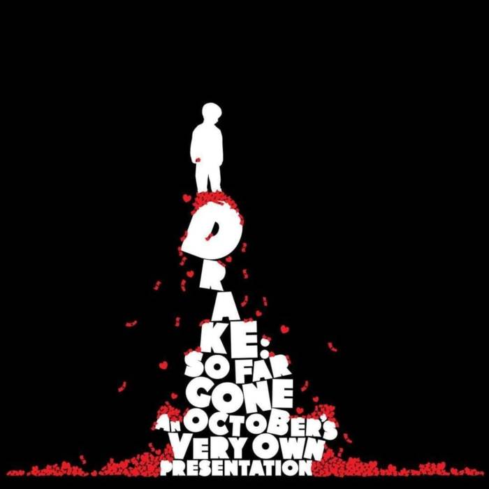
So Far Gone
When: 2009
For Drake, the So Far Gone mixtape represented a turning point. Although it was his third mixtape, it forced him to participate in a bigger discussion about the rap game’s future. Darkie, a Toronto-based illustrator, created the cover graphic by flipping an advertisement from The Economist. The OVO crew, according to Darkie, admitted to Complex that they were unsure of their goals but that they desired a change. “Every rapper you know wants to have their face on the artwork, and it got to the point where it irritated me a lot. I was given the freedom to come up with something by Oliver [El-Khatib]. I sent him a tonne of artwork that I said I’d love to flip, and he chose an advertisement for The Economist. I turned the story around, and we substituted money and hearts for the spider the child was interested in. According to Darkie, it just “felt perfect with the atmosphere of the mixtape.”
Drake revealed to Complex that chats he had with Oliver served as the inspiration for the album art. “We were chatting about women and how we were talking about them one night. It was quite egregious and insulting. Immediately after we hung up the phone, he texted me asking, “Are we turning into the guys our mothers divorced?” Actually, that is also where the cover originates. Just this kid, looking for love and money.
Its striking and graphic cover shows a moment when Drake’s identity as an artist began taking shape. —AH
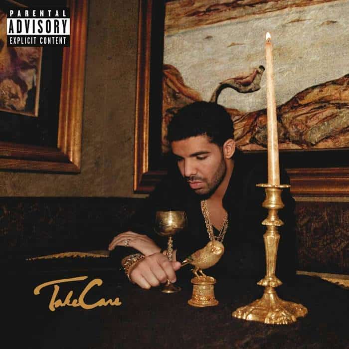
Take Care
When: 2011
Drake was aware that he was on the verge of becoming rap royalty even before the critically acclaimed release of his enormously popular and career-defining sophomore album Take Care. The rapper described to MTV News back in 2011 how the now-iconic cover image depicted his toiling with stardom as he ascended hip-pantheon hop’s of winners. The photo was taken in his favourite restaurant in Toronto, Joso’s.
He said, “That child that’s just magically gone from his mom’s basement in Toronto to being a king, that’s who’s sitting on that record cover. That is the subject of the record cover, and it required a lot of introspection because doing so could drive you mad.
The cover is straightforward yet powerful. It shows The Boy accepting the man he was growing into while holding a golden goblet and standing next to an all-seeing owl. While trolls used it as the focal point to label him sensitive, the artwork serves as the ideal vehicle for the self-reflective information it conveys. Drake can be heard and seen in Take Care ruminating on the marathon he is still running but is certain he will win while contemplating the riches that have not yet arrived in full. It’s debatably one of his best albums, and the cover foretells its own demise—a talent that Drake would eventually master. —JR
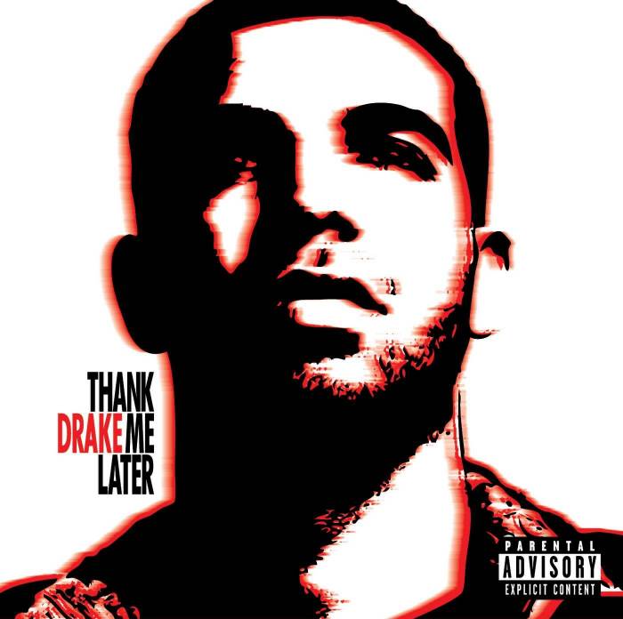
Thank Me Later
When: 2010
It doesn’t get any more formulaic for major-label debuts than this. Thank Me Later’s CD and cover image both have an overly generic feel to them. Drake is being far too cautious. A debut album with notable features from Lil Wayne, Alicia Keys, Jay-Z, and others isn’t introduced by this cover image. It doesn’t have Drake’s fingerprint and seems easily replaceable. Unlike the cover for his previous mixtape, So Far Gone, which depicted a young Drake using his brand as a ladder to ascend rap Mt. Olympus, the cover for Thank Me Later shows him in a neutral position. This song lacks the ambition of “Miss Me” and the guts of “Fancy.” It’s just an infrared Drake that is out of focus. Although it was released in 2010, there was still considerable need for improvement. Ryan Rose
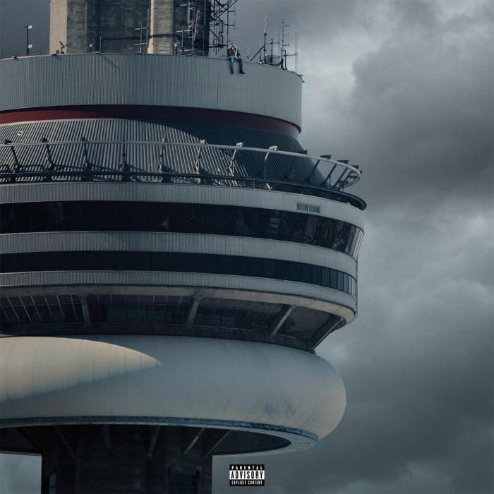
Views
When: 2016
Drake shared the album’s cover on Twitter a few days before Views, his fourth studio album, was formally launched. It’s a fitting cover, portraying Drake perched on Toronto’s CN Tower, also known as the Canadian National Tower. The 1,815-foot-tall broadcast and communications tower was once the tallest freestanding building in the world until 2007. Visitors can climb the tower to see sweeping views of Toronto.
Caitlin Cronenberg, a Canadian photographer, and Nicky Orenstein, an art director, gave the image a big, steely atmosphere. Drake’s current self-confidence and the gloomy winters of Toronto were presumably the inspirations for the song. He has a penchant for being dramatic and coming off as haughty. It is nothing short of magnificent to see him perched atop the CN Tower, looking out over all of Toronto, with his feet dangling over the sides. Drake wasn’t actually seated atop the CN Tower, it turned out. He was added via photoshop. Drake’s presence on the album cover wasn’t necessary, but we’re sure he was aware of the potential backlash. He was correct, too. Online chitchat and memes resulted from it. Even some started to wonder if it was a stock photo. Nevertheless, the image is well-framed and precisely captures what Drake was going for with his album and reputation. —AH
What A Time To Be Alive
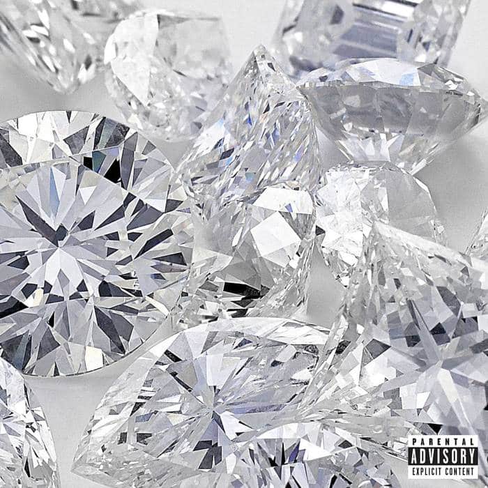
Okay, let’s get everyone out of here since this is probably one of the worst album covers to appear in the last ten years. It’s unfortunate that one of Drizzy and Future’s greatest suggestions for their joint mixtape release was this Shutterstock image of close-up diamonds. But I guess we can’t really blame Future given that he utilised a Shutterstock image that was discovered on the cover of a chemistry textbook for Dirty Sprite 2. Photographer Christina Tisi-Kramer, who is based in New York City, took the diamond stock image. Tisi-Kramer said in an interview with Complex that she also took some stock photos for herself in addition to photographing the jewels for the Julius Klein Group, a business that assesses the worth and clarity of diamonds. According to Complex, “It’s one of my best selling photographs because of the unremarkable luxury products that they are.” That’s fantastic for her, but we all know Drake could have done a better job. — Lei Takanashi
Drake was searching for an iconic painting that would serve as my signature, according to Nelson, who spoke to MTV. As a result, I treated this as if it would have significance not just for now but forever. Drake and I agreed that it would endure beyond what is currently depicted on the majority of album covers. We desired something distinctive from other things. —MD

